Workplace Chair Yoga Apps Without Notification Fatigue
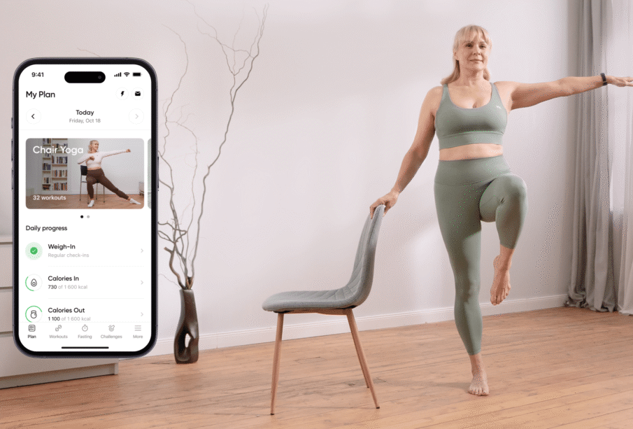
A wellbeing app usually begins with good intentions. It reminds employees to move, offers short routines and makes practice available without booking a class. Within weeks, however, its prompts may join the same stream as emails, calendar alerts, chat messages, security requests and project updates. The movement reminder becomes one more interruption to dismiss.
A workplace chair yoga app should therefore be designed around attention, not merely content volume. Useful technology helps a person choose an appropriate moment and begin quickly. It does not assume that more notifications, streaks and engagement messages automatically produce healthier behaviour.
Notification Fatigue Is a Design Problem
Employees do not experience wellbeing prompts in isolation. A notification arrives amid deadlines and digital demands. Even a supportive message creates friction during focused work, a client call or a difficult task.
Repeated prompts also lose meaning. If users dismiss the same alert every hour, the app teaches them that its messages are irrelevant. Increasing frequency may lift short-term clicks while reducing trust.
The key question is not, “How often can the app remind people?” It is, “What minimum level of prompting helps users act without fragmenting attention?” The answer varies by role, schedule and personal preference.
Start with User-Controlled Timing
An app should ask when movement is realistically possible. A customer-service worker may have scheduled breaks. A manager may prefer a reminder after recurring meetings. A designer may need uninterrupted focus blocks and choose a longer routine at lunch.
Default settings can provide a starting point, but users need control over timing, days, frequency and silence periods. Turning off notifications should not disable the programme or trigger guilt-based messages.
Calendar-aware suggestions can be helpful if privacy and permissions are handled carefully. The app might identify an open period without reading meeting titles or participant information. It should not pop up the moment a call ends, because employees may need time for notes or urgent follow-up.
Replace Random Alerts with Contextual Cues
User-Initiated Break Windows
Let users define one or two daily windows when a prompt is welcome. A prompt inside a chosen window feels different from an unpredictable interruption. If no action is taken, the app can wait until the next window instead of repeatedly escalating.
Event-Based Cues
Movement can be linked to natural transitions, such as the end of a focus timer or a voluntarily selected recurring meeting. The user chooses the event. The app should not monitor private behaviour beyond what is necessary.
Quiet Visual Availability
A desktop menu icon or browser tab can show that a break is available without producing sound, vibration or a pop-up. This supports self-initiation and keeps the app accessible when the employee notices a suitable moment.
Weekly Planning Instead of Daily Pressure
A short weekly prompt can invite the user to select preferred sessions in advance. Planning reduces the need for repeated in-the-moment persuasion and makes practice fit the calendar.
Content Should Be Searchable in Seconds
When an employee has five minutes, they should not navigate a long assessment, motivational feed or product catalogue. The library can be organised by time, body area, position and work context.
A useful filter might offer two, five and ten-minute sessions. Another can distinguish fully seated routines from options that include standing. Labels such as “after long typing”, “between calls” or “before commuting” describe practical moments without making medical claims.
Each routine needs a brief setup screen. It should state the space required, chair type, whether standing is included and any relevant caution. Once the session begins, the interface should remain visually quiet.
Avoid Features That Turn Recovery into Performance
Streaks can motivate some users, but they can also create pressure and all-or-nothing thinking. Missing a day may feel like failure even when workload or illness made rest more appropriate. An app can track completed sessions privately without displaying a fragile daily chain.
Leaderboards are especially unsuitable for workplace movement. Employees differ in schedules, health, disability and privacy preferences. Ranking minutes completed rewards availability rather than wellbeing and can make voluntary participation feel monitored.
Calorie estimates and flexibility scores are also poor fits. Short seated movements are difficult to translate into meaningful energy data, and a camera cannot reliably judge internal comfort. The app should encourage self-selected range rather than declare a pose correct from appearance alone.
Design for Accessibility from the Beginning
Captions, audio descriptions, adjustable text size and high-contrast controls should be standard. Instructions should not depend solely on colour or sound. Users need enough time to change position without racing the video.
Offer mirrored and non-mirrored viewing options, along with the ability to pause without losing place. Camera use should never be required for basic access. Employees may work in shared homes, open offices or environments where video is inappropriate.
Movement language should include choices. “If this suits you, lift one arm” is more accessible than “Everyone can do this”. Fully seated alternatives should be easy to locate, not hidden in a separate remedial category.
Treat Employee Data Conservatively
The app should collect only what is necessary. An employer generally does not need individual information about pain, mood, skipped sessions or health conditions. Aggregate programme data can be sufficient for evaluating overall use.
Employees need a clear explanation of what the organisation can see. If a manager can identify who completed a session, participation is no longer meaningfully private. Consent in an employment setting is complicated by power differences, so minimal collection is safer than relying on lengthy permission screens.
Retention periods also matter. Old activity data should not be stored indefinitely without a defined purpose. The app should provide straightforward deletion and export controls where applicable.
A Low-Noise Product Model
A practical design could use one optional planning prompt each week and no default daily alerts. Users select preferred movement windows and can add a quiet calendar entry. During the day, the app remains available through a small icon.
When opened, it displays recently used routines, saved favourites and simple filters. A session begins within two or three selections. After completion, the app asks one optional question about usefulness rather than demanding a rating, mood entry and social share.
If the user stops engaging, the system should not send an escalating sequence. A single neutral check-in can offer fewer prompts, different timing or complete silence. Non-use may reflect a deliberate preference rather than a behavioural problem.
Combine Digital Access with Human Teaching
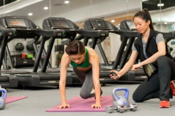
An app is efficient for repetition, but it cannot observe every chair, symptom or movement strategy. Periodic live instruction can help employees learn stable setup, suitable intensity and alternatives. The app then reinforces familiar material instead of asking users to interpret everything alone.
This hybrid approach also creates a feedback route. Employees can ask questions in a live setting, and recurring confusion can inform clearer app content without collecting intrusive personal data.
Sessions with Yoga Edition can provide the human layer, while a low-noise library supports practice between classes. Technology should preserve the instructor’s emphasis on choice instead of converting it into automated correction.
Evaluate More Than Engagement
High notification-open rates do not prove that a product supports wellbeing. Evaluation should consider whether prompts feel disruptive, whether users can find a relevant routine quickly and whether privacy settings are understood.
Anonymous feedback can ask if employees feel more in control of movement breaks. Product teams should also track notification disabling, not as failure, but as evidence that defaults may be too frequent.
Conclusion
A workplace movement app should reduce friction without adding digital pressure. User-controlled timing, quiet availability, rapid content access and conservative data practices are more valuable than constant reminders.
The best technology knows when to stay silent. By making a useful routine easy to find and equally easy to postpone, the app supports autonomy and gives attention back to the employee.
Frequently Asked Questions
How many notifications should the app send?
There is no universal ideal. Start with notifications off or at a low frequency, then let users choose. A weekly planning prompt may be more useful than repeated daily alerts.
Should the app connect to employees’ calendars?
Only with clear permission and minimal access. It can use availability data without reading meeting names or participants, and users should be able to disconnect it easily.
Are streaks helpful for movement habits?
They help some people but create pressure for others. Private completion history and flexible weekly goals are less punitive than an unbroken daily streak.
Can employers see who completed each routine?
Individual completion data should generally remain private. Employers can evaluate aggregate use and accessibility without monitoring a person’s health behaviour.
Does the app need camera-based pose correction?
No. Camera analysis introduces privacy and accuracy concerns, and it cannot assess internal sensation. Clear demonstrations and choice-based cues are often more appropriate.
What makes a routine easy to find?
Use practical filters for duration, seated or standing format, body area and work context. Keep setup information brief and allow saved favourites for repeat use.